2013年7月22日星期一

BOSS and Brooks Brothers BY Qinyu

Last Thursday, we went to the Lenox mall. That was  a really big mall full of lots of entities. I loved food and clothes there. As for clothes there, the styles were so different. That was very interesting. So I took some photos and did some compares.
 
 
This professional "BOSS" came from Germany. From the picture, you can see that clothes of this brand are more formal. They are suit  successful businessmen but also look good on young guys who are energetic.


 Brooks Brothers, America. The clothes here seemed to be more casual, right? I was glad to find school uniforms of  universities in Atlanta. They looked bright and well designed.


Though born in different places, these "guys" are all popular. Their clippings are nice. People love their different but wonderful styles and feel confident when wearing them.

Diesel & Brooks Brothers by Xiaoyan


Diesel is a famous as a brand of fashion with washed denim. Holes, smirches are the symbol of their brand.

“Be stupid” is a successful set of their advertisement, which won world awards.


The brief structure with just three flat surfaces is used in their door.
The showcase of diesel is really eye-catching for fashion men and women.

A mirror in their shop, which is very special, shows their theory for fashion.

Brooks Brothers, an American brand, is famous for its suits and shirts.

Pillar with tradition western style is used to form the door of the shop. 
The showcase tells their customers are mainly students and office workers.

Special design of their shop is probably loved by paper workers and intellectuals.


Vineyard Vines VS FOREVER 21 BY Yuqi

window display outside the store: just like on the deck of a incredible sailing boat
well-furnished store and the cute brand logo
eye-appealing poster outside the store
one of many label tags: the evidence of globalized industry
the walking advertisement that you can see everywhere in the mall
inside the store: there was soothing music inside as well

2013年7月15日星期一

AD of Georgia Aquarium by Lutao Dong


I was struck by this huge poster when shopping at the Lenox Square Mall yesterday; it was an advertisement of the Georgia Aquarium. Unlike other advertisements that invade our sights and force us to pay attention to their products, this poster exerts its effect so naturally and spontaneously with its simplicity and beauty, that I even regarded it as an artwork at the first sight.

In this poster, a little girl is singing with great enthusiasm on a piece of iceberg, along which emerged three cute white whales were singing the backup for her. Below it there bears the saying “where imagines go to play”, and the word “imagines” is emphasized with bold character and the color of the little girl’s dress. The rhetoric strategy involved in this AD is Pathos, which appeals to one's emotions.The combination of the scene and the slogan conveyed the concept that the Georgia Aquarium can offer you an fanciful experience just like a fairy tale. In my opinion, this AD is designed most likely to attract tourists, especially those with children. 


I also found some other ADs of Georgia Aquarium on the Internet; they have the same style with the picture I took, where a fantastic image is presented along with the same slogan. Again, several imaginary scenes are depicted: jellyfish can turn into colorful bubbles; rays could fly like jets in the ocean; a girl playing with a hula-hoop formed by a flock of tropic fish. In addition, one of these ADs also presents a short paragraph, alleging that the aquarium is the world's largest; I believe this method belongs to Logos, which simply appeals to one's logic.

To conclude, the advertising strategy of Georgia Aquarium is successful. The image is simple yet full of creativity; the slogan is concise and easy to recall; the potential audience is precisely focused and the core concept is clearly conveyed.

2013年7月14日星期日

Energetic Adertising by Qinyu


ad.1

ad.2


                     (From http://www.midtownatl.com/)

I took the picture of ad.1 on the way to the bus station around the campus. Since it is hung on the streetlight, the audience is every citizen. I think it is supposed to attract people to the midtown of Atlanta.

Firstly, there is a blank in the word “midtown”, which explains the location of midtown accurately. Then, the ad.1 says “in the heart of it all”. It expresses a sense that you can enjoy your life in midtown fully. You can do everything you want in this area. Midtown is a perfect place to live in, and to come to. Lastly you will notice the website address on the bottom of the ad. MidtownATL.com is a website that powered by Midtown Alliance whose aim is to create a safer, happier, and more unique area. You can find almost everything about midtown of Atlanta on this website. It is very convenient.

After that, I found ad.2 from Midtownatl.com. These two ads both use different kinds of colors to express its logo and catch people’s eyes easily, just like fancy neon in the city full of cheers. It shows the colorful life in midtown and expresses the high spirits the area has. They are energetic and inspire people to explore and enjoy midtown.


THEN LET’S TALK ABOUT ADVERTISING STRATEGIES THE ALLIANCE USED.

PATHOS


 From http://www.midtownatl.com/
It uses strong colors to show excitement and to generate citizen’s enthusiasm to love this area.


ETHOS


From http://www.midtownatl.com/

It uses famous people to prove that the musical is worth seeing.


LOGOS
                                
                                                    
                                               From http://www.midtownatl.com/

It uses “learn more” to let people know about the details.

Cheers for the smooth taste! by Yuqi


Cheers for the smooth taste!

On the way back to campus, exhausted and thirsty, the advertisement featured the amber liquid splash immediately caught my eyes. “Whisky started. Maple finished.” In average adults’ eyes, whisky is sort of spicy. “Can the kind of spirit that usually burns our throat give us an experience of smooth and a taste of woody and warm just like maple syrup?” I think many people pose a question like this.


In search of the relative information online, I’ve known that the company Crown Royal is the top-selling Canadian Whisky in USA; thus, the brand itself creates a sense of credibility. Moreover, the poster is simple yet explicit. Even from the distance, we can see the iconic whisky bottle of Crown Royal, which can convey a sense of luxury and gorgeousness to audience. In the hot summer day, who can resist a cup of a refreshing and smooth spirit? Indicated by the lines on the poster, Maple Finished Whisky, the new flavored one, brings together the traditional Crown Royal Whisky along with natural maple flavoring. Located in midtown of Atlanta and surrounded by CNN Center, the World of Coca Cola and Atlanta Aquarium, the intended audience might be the early whisky consumers who are interested in soften and sweetened whisky.


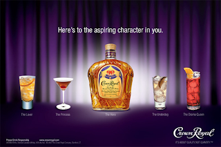
Compared with other ads (shown as below), the Maple Finished Whisky seems less expensive and affordable; as we know that blue and purple are the color of elegant and mystery. So it is a good choice for average people to get a taste of luxury.
 
 
                 cn.reuters.com
               www.crownroyal.com

Advertisement of U-Haul by Xiaoyan


<!--[if !vml]--><!--[endif]-->
I found this ad. on a van after a small truck. U-Haul is a company managing the rental of trucks and trailers. Through my research of U-Haul, I found the ubiquity of U-Haul’s trucks and trailers in America and Canada. The livery used on rented vehicles is widely recognized, primarily consisting of white and a thick horizontal orange stripe, in addition to a large state- or province-themed picture, known as SuperGraphics.[1]
The picture showed above includes the iconic mark of white and orange, which is quite eye-catching. As a great whale-watching place form November to May, the small city Coos Bay is also mentioned in the ad (in tiny words showed not very clear in the photo). The colors and Coos Bay are application of pathos to provoke your excitement of an America’s moving adventure in their trucks and trailers.
The strategy of ethos is used by the words, such as “finest and safest”, to ensure consumers a good quality of service. 
As an example of logos, “Moving van rentals” tells the exactly what U-Haul does, giving a logic of what consumers will get.
Two more examples are listed to show what typical U-Haul SuperGraphics are.

U-Haul SuperGraphics: Georgia, from http://www.flickr.com/photos/parvindersingh/2365470264/
The trucks are painted with SuperGraphics which are educational images of different states and provinces across the United States and Canada.[1]
This is SuperGraphics of Georgia, telling about a dramatic canyon in western Georgia, which remind of curiosity of U-Haul’s website and interest of visiting in that truck just the same as the ad does before this.

<!--[if !vml]--><!--[endif]-->
In this picture, the history of abolishing slavery in Canada is illuminated. It’s definitely a reach to compare the path to freedom on the Underground Railroad to the path you’ll be taking in your U-Haul—no matter where you’re moving [2], which results in a sense of holiness after seeing the ad.


Quotation marks: